 Creating a decent political flyer is not a difficult task to undertake. There are millions of examples out there and print shops usually have stock templates that candidates can customize. This flyer for Jim Dixon who ran in a special election for Massachusetts State Representative, decided to start from scratch while using a graphic designer who probably just started their freshman year of high school.
In contrast to my last pFume review, this flyer is extremely difficult to discern which side is the front and which side is the back (2). I assume that the image pictured on the left is the front since it has basic messaging along with election dates, however, the image on the right includes a candidate portrait and logo sandwiching the majority of the flyer's text.
This problem is further accentuated by the call to action at the top of the flyer (1). This is something that should grab people's attention, but instead it is printed using the same font, size, and italics used for the election dates directly underneath. This blends everything together and makes the flyer look as if it is missing a header. There is a certain flow to an advertising brochure that people expect, and it can get confusing when the reader does not even know where to begin.
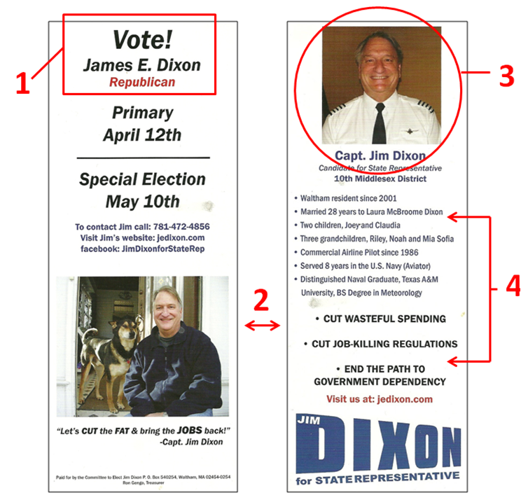
There is an interesting back story that goes along with the candidate portrait (3). I met Jim at a convention right at the start of his race. After a lengthy conversation about how to kick-off his campaign, I made it a point to emphasize that the first thing he has to do is to get professional photos done. Months later I ran into Jim again and he handed me this card. I looked at it, then looked at him, and all he could tell me is that people really liked the picture of his dog. I shook my head in disgust.
Bullet points are a great tool to organize the information presented on a political push card. Listed on the back of this flyer, there is a group of bullet points immediately followed by another group of bullet points (4). Even though the second group is bold and centered, there is very little distinction between the two separate sections.
White space is always something that is respected in flyer design and this card has plenty of it. Regardless, there is no order to the information within the whitespace resulting in a visually unappealing and confusing experience. This is one of the few cases where poor layout decisions eliminates the advantage of sufficient white space.
The Good
1. Ample white space
2. Nice picture of him with his dog
3. N/A
The Bad
1. Not a clear distinction between the front and the back of the flyer
2. Terrible candidate portrait
3. Poor layout
Overall Rating: F
 Interesting Side Note: I recently visited Jim Dixon's Facebook page and noticed that he finally took my advice and got professional portraits done. When compared to his original photos, it is quite easy to see how important it is to rely on professional photographers to do what they do best.
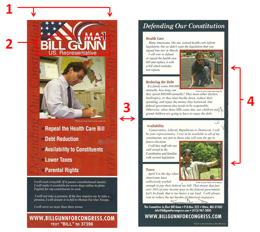
 Candidate photos and logos are the two most important marketing tools used by every political campaign. Once these two things are established, all other marketing pieces will fall into place. This flyer by Bill Gunn for US Representative of Massachusetts shows that even the most essential components of a campaign can sometimes be the least effective.
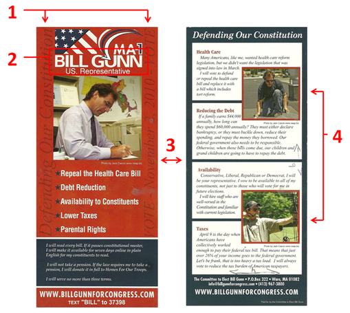
The front of this card has a conventional layout with a few twists. It contains the standard logo, picture, contact information, and also a few bullet points taken from the candidate's platform. An interesting decision was to include the motto and election date using a vertical script with a maroon on red background (1). Even though this was intended to be subtle, anytime you shift the text direction 90° it creates a difficult experience for the reader. Since Gunn also included a rather long personal message on the front, the only area that is not covered in text is the picture.
With the last name "Gunn," there should have been no problems creating a logo that resonates with the voter. However, the logo that was created (2) minimizes the impact by including the stars and stripes, a large checkmark, and a "MA-1." In fact, the checkmark cuts into Gunn's last name which makes it difficult to read - something all campaigns should avoid.
When creating a flyer layout, it is important to make a distinction between the front and back of the flyer. At a quick glance, the reader should know which side of the flyer they are looking at. One thing I like about this flyer is how it accentuates this concept by using red with blue accents on the front, while the back uses blue with red accents (3), making a seamless transition for the reader.
There is an old saying, "A picture is worth 1000 words," and in political marketing this could not be more true. Each of the photos used on this flyer are fine on their own, however, they do not add any diversity when grouped together.
The back of the flyer (4) includes a photograph of Bill doing some roof repair accentuating his blue collar background, while the second photo is intended to appeal to sportsmen. When scanning all of the photos side by side it is rather peculiar that there is no one else photographed other than Bill. The absence of Bill's family, friends, or even supporters makes him seem... well, antisocial. Even worse, not one of these photos of Bill shows him with a smile on his face.
"Of all the things you wear, your expression is the most important." - Janet Lane
The Good
1. Good distinction between the front and back
2. Easy to read bullet points
3. N/A
The Bad
1. Hard to read candidate's name in the logo
2. Vertical and Horizontal words on the front
3. Photographs used are 1 dimensional
Overall Rating: D
 Looking at this flyer from Massachusetts State Representative Alan Silvia only three words come to mind: Too Much Information.
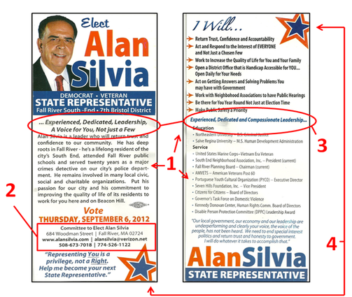
On this push card Silvia gives us the long answer of who he is, what he plans to do, and includes his entire professional resume (1). To accomplish this feat he used a small font size that is usually reserved for the fine print of legal documents. If that was not bad enough, he filled the remaining free space with two unique personalized quotes!
One of the most important aspects of any public servant is accessibility to the public. In order to do this, people have to know how to get in touch with the person representing them. Instead of making this information easy to read, Silvia chose to make it so small that it almost unreadable (2). Even the website url, arguably the most important contact information of a political campaign, is so difficult to read that you practically need a magnifying glass to find it.
Slogans are used by political campaigns to ingrain one specific thought about the candidate in the voter's mind. The slogan has to be consistent and used throughout the campaign for this to work.
In what I believe is Silvia's slogan (this card makes it difficult to know for sure) there is no consistency. On the front of the card it reads, "...Experienced, Dedicated, Leadership, A Voice for You, Not just a Few", while the back of the card reads, "Experienced, Dedicated, and Compassionate Leadership..." (3). There is nothing worse in marketing than getting your own slogan wrong. Silvia should have kept the slogan, "A Voice for You, Not just a Few", enlarged it, and punctuated this on both the front and back of the flyer.
While we are on the subject of these two different slogans, I need to mention the incorrect usage of ellipses, or better known as "...". In one slogan Silvia starts with an ellipsis, while the second slogan ends with an ellipsis. I get confused looking at both of these because I cannot find a single good reason why these ellipses are even being used at all.
As crowded as this card is, there are still opportunities to make this flyer appealing to the eye by creating white space. However, Silvia eliminated these opportunities by ramming graphics of stars in them (4). When designing a flyer remember that creating space will always make it easier for the reader to consume the message.
In his next election, Silvia should find a new graphic designer since this flyer proves the one he used for this one knows nothing about design.
The Good
1. Nice headshot
2. Name clear on both the front and back of the flyer
3. Election date listed
The Bad
1. Too much information
2. Inconsistent campaign slogan
3. Incorrect usage of ellipses
Overall Rating: F
 Balancing the right amount of substance with a design that is pleasing to the eye is tough to do. Too little substance can make a candidate seem unqualified, while too much information jeopardizes how much the reader will retain. This flyer for Massachusetts State Representative, Kim Ferguson is a good example of how to handle that delicate balance.
The front of this card has a very simple design that includes all the basic information you want to resonate with the voter. The font size is large enough to make the information easy to read in a matter of seconds, while the ample border space makes the visual experience inviting to the reader.
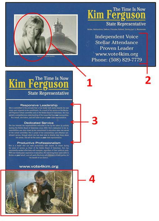
Being a full-color flyer, it is interesting that Ferguson decided to use a black-and-white picture of herself instead of a color one (1). Unconventional as this may be, the lack of color in the picture forces the reader's eye to gravitate to the only splash of color on the front of the flyer - her name. So this may have been done intentionally for this very purpose.
Another critique of this flyer is that the 3 campaign points blends into the contact information (2), making it look like one block of text with 5 lines. Creating more space between the two sections and/or inserting a divider line would give both sections just enough separate distinction.
Looking at the back of the flyer, you will find a very clean layout that complements the front of the flyer quite nicely. There are three distinct sections: Logo, body, and photo - it does not get much simpler than that!
The body itself is broken into 3 sections, all with distinct headings (3). This is where the balancing act is navigated perfectly. Most people will read the headings while bypassing the actual body. Having the right amount of text will validate the heading for those people who choose not to read the body, while providing just enough substance for those readers who want to dig a little deeper.
How many times have you heard the cliché of politicians kissing babies? The reason why this is so prominent is because early on politicians figured out that kids sell, and when you throw puppies on top of it, you have a winning duo that no voter can deny.
In another unconventional move, Ferguson did not include herself in the picture on the back, but instead used a great photo of her son holding his puppy on the waterfront (4). No matter how you look at it, the best political pictures always include puppies, kids, or both - so always make sure to include pictures like these when determining a flyer's layout.
The Good
1. Simple layout
2. Meaningful paragraph titles
3. Kids & Puppies!
The Bad
1. B&W Candidate Photo
2. Bullet points and contact information blends together
3. N/A
Overall Rating: A
|


 RSS Feed