One thing I always look for in leaflet design is if it stands out from the countless other junk I receive on a daily basis. I look forward to things that break me out of my normal behavioral patterns to stop and take notice of something. Coming home a few weeks ago I had the pleasure of having this political advertisement grab my attention and make me say, "wow, I have to use this idea someday!".
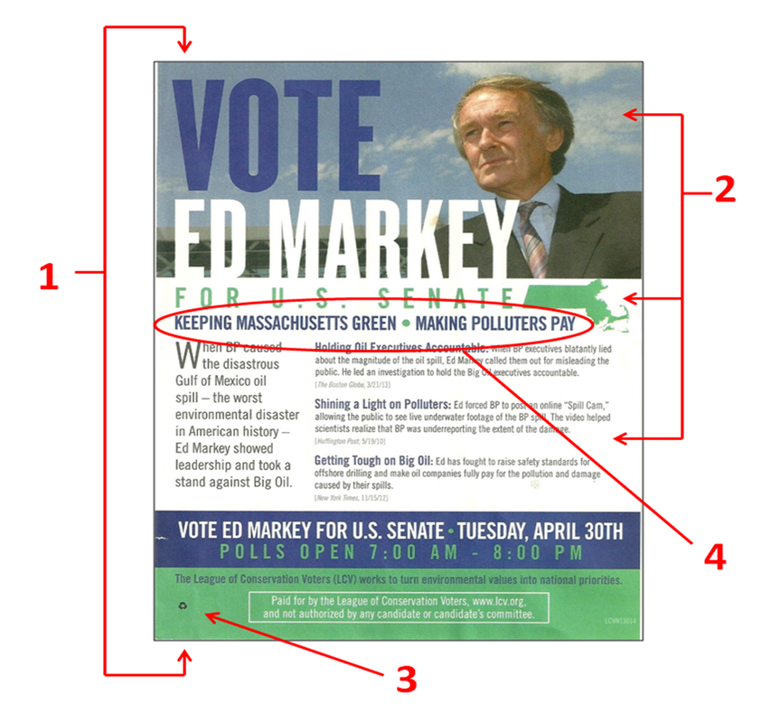
This one-sided flyer for US Senate candidate Ed Markey in Massachusetts was published by an outside organization called the League of Conservation Voters who issued this in support of Markey's stance on environmental issues. Since it is one-sided, there has to be a delicate balance of candidate promotion and substance which this layout did well. The logo and portrait prominently stands out leaving the reader with no mistake about who this flyer is in support of. Also the font size of the body may be a little small, but it effectively uses quotes from various news sources to validate their endorsement.
Another thing I like is that the environmental message of the flyer is not only conveyed in the text, but it is also incorporated in the design (2). I love the clean blue skies behind the image of Markey, while the green silhouette of Massachusetts continues to emphasize their belief that Markey is the "green" candidate. I also like how this point is further punctuated by the subtitle recycle logo (3), which not only expresses that this flyer is printed on recycled paper, but ties the whole environmental focus together.
The only thing I would nit-pick is that at a quick glance this flyer looks like just another political piece pushed out by the Markey campaign instead of a flyer with an environmental slant. The subtle imagery is just that, and this flyer would benefit if it included something more overt to emphasize the focus of the flyer. One solution may be shortening the slogan (4) and increasing the size of a more refined message instead of the two distinct statements that are currently used.
However, it should be noted that sometimes organizations try to disguise the focus of the flyer to make it look as if it came from the campaign itself. This is primarily done when a group wants to support a candidate by getting another marketing piece distributed to the voter, without overtly pushing their specific issue. This strategy may have been the case with this flyer.
So by now you are probably wondering what about this design grabbed my attention and had me talking about it for days. The reason why this flyer is one-sided is that it is a giant post-it note! Along the backside of the flyer there is sticky adhesive (1), which allows supporters to stick this flyer on doors and mailboxes. It is illegal for anyone other than postal workers to put anything in a person's mailbox, but the law does not regulate what people can stick on the mailbox. When I walked up to the house and saw this flyer on the side of the mailbox, it immediately grabbed my attention and broke me out of what I normally expect see as I enter the house - a great sign of effective marketing!
The Good
1. Innovative idea to make the flyer jump out
2. Design of the flyer subtly backs up the message
3. Quotes from the press validates intent of the flyer
The Bad
1. Body of text could be easier to read
2. Environmental message could be more overt (although this might have been done intentionally)
3. N/A
Overall Rating: A
 RSS Feed