Public Service Announcement - There is no need to adjust the color settings on your computer. The colors that you see are the actual colors of the image. Sorry for the confusion.
When I first found this flyer I knew I came across the Holy Grail of poorly designed political advertising. I am not sure who gave the final approval of this project, but this flyer is justification for political consultants even at the local level.
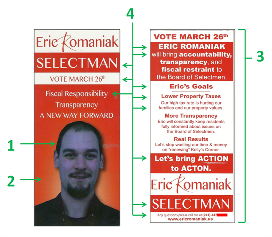
One of the most obvious concerns is that the coloring of the portrait makes the candidate look like a Smurf (1). The saturation of blue in the photo gives Romaniak an unnatural appearance and actually blends his skin tone in with his dark clothing and facial hair. I actually visited his Facebook page to see if he had a skin condition, but rest assured, this fatal flyer flaw is completely the fault of the designer.
I cannot think of a single circumstance where I would suggest a solid red background behind a portrait (2). Red is a very aggressive color and can invoke emotions of rage and hostility in the reader. Having the longest wavelength of all colors, it pulls the reader's eyes away from the candidate's portrait which is something designers never want to do. With Romaniak's unnatural blue appearance, he might as well Photoshop horns and a handlebar mustache on his face since this combination gives him an almost demonic appearance.
To save money, candidates sometimes resort to single color printing. When looking at the back of the flyer (3), it is clear how ineffectual this strategy is especially when using an abrasive color like red. The reason why teachers use red pens to grade papers is because it grabs the attention of the student and has them focus on where they went wrong. When everything is red, it is difficult for the reader's eyes to focus on a specific area making it tough to read. It is better to use soft colors for text like black, blue, or grey, while saving red text for punctuation purposes only.
Another disrupting aspect of this flyer is that there is absolutely no consistency of font size (4). On both the front and back of the flyer, each separate section introduces a different font size and/or bold text. Adjusting font size is a great way to make important things stand out, but it is uncomfortable for the reader to go on a roller coaster ride from tiny to gigantic words. Font consistency is always the best policy when designing literature, and this flyer has none.
The Good
1. Front of flyer is not cluttered
2. N/A
3. N/A
The Bad
1. Major color issues
2. Professional photo needed
3. Random font size is distracting
Overall Rating: F
When I first found this flyer I knew I came across the Holy Grail of poorly designed political advertising. I am not sure who gave the final approval of this project, but this flyer is justification for political consultants even at the local level.
One of the most obvious concerns is that the coloring of the portrait makes the candidate look like a Smurf (1). The saturation of blue in the photo gives Romaniak an unnatural appearance and actually blends his skin tone in with his dark clothing and facial hair. I actually visited his Facebook page to see if he had a skin condition, but rest assured, this fatal flyer flaw is completely the fault of the designer.
I cannot think of a single circumstance where I would suggest a solid red background behind a portrait (2). Red is a very aggressive color and can invoke emotions of rage and hostility in the reader. Having the longest wavelength of all colors, it pulls the reader's eyes away from the candidate's portrait which is something designers never want to do. With Romaniak's unnatural blue appearance, he might as well Photoshop horns and a handlebar mustache on his face since this combination gives him an almost demonic appearance.
To save money, candidates sometimes resort to single color printing. When looking at the back of the flyer (3), it is clear how ineffectual this strategy is especially when using an abrasive color like red. The reason why teachers use red pens to grade papers is because it grabs the attention of the student and has them focus on where they went wrong. When everything is red, it is difficult for the reader's eyes to focus on a specific area making it tough to read. It is better to use soft colors for text like black, blue, or grey, while saving red text for punctuation purposes only.
Another disrupting aspect of this flyer is that there is absolutely no consistency of font size (4). On both the front and back of the flyer, each separate section introduces a different font size and/or bold text. Adjusting font size is a great way to make important things stand out, but it is uncomfortable for the reader to go on a roller coaster ride from tiny to gigantic words. Font consistency is always the best policy when designing literature, and this flyer has none.
The Good
1. Front of flyer is not cluttered
2. N/A
3. N/A
The Bad
1. Major color issues
2. Professional photo needed
3. Random font size is distracting
Overall Rating: F
 RSS Feed