There are not many perfect political flyers, but when I saw this one I knew I found the perfect example of what NOT to do. This flyer is so bad that I am keeping it in my portfolio to showcase horrendous campaign decisions. Where to start...
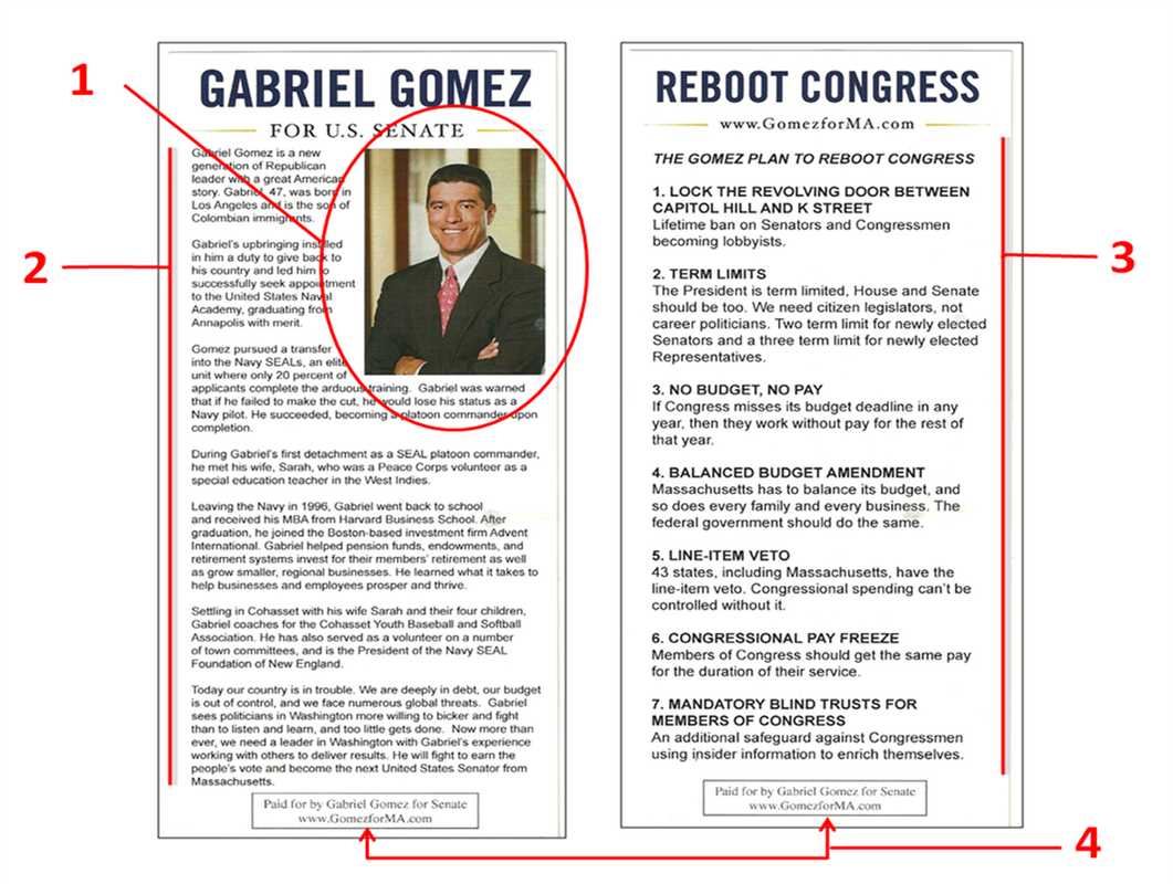
Being the youngest and best looking candidate in this race, the picture of Gabriel Gomez (1) is actually a good one exhibiting a warm, trusting smile. Since this is one of the best selling points of Gomez, this picture could have been better showcased, but it is instead squeezed off to the side making way for an overabundance of text (2).
Most push-cards are used as a portal to drive the reader to places where they can get more information about a candidate like the campaign website or social media. Bypassing this philosophy entirely, Gomez decided to put all the information about him on a single 4x9 card. The front is filled with text that depicts Gomez's history (2) and the backside is filled with more text outlining some of his platform (3). Too much text is tough on the reader's eyes and can intimidate people from reading any of it.
Another thing to note is that Gomez left his name off the back of the flyer. For someone who clearly wants to introduce himself to the public for the first time, you need to hammer that name home with every opportunity you have. It may seem redundant, but you can never push your name enough on the average voter.
And speaking of redundancies, some states require a statement declaring who paid for the political advertisement. This is usually a pain for graphic designers who try to work it into the layout without taking up valuable real estate. Gomez must have really liked this disclaimer since he decided to print it on both sides of the flyer (4). This is an unnecessary effort that takes up space that could be used for more interesting things (hopefully for something other than more text!).
Final Thought - After mulling over this flyer for quite some time, I came up with a justification for a this bizarre flyer design. Gomez was running in a special election with an expected low voter turnout. The standard demographic most likely to vote in this election are people 50 and over. Since these voters are more prone to read newspapers, mailers, etc., it may be possible that this push-card was designed with these voters in mind. However, I still do not believe that this is a strong enough justification to design such a push-card.
The Good
1. Great picture
2. Clean logo
3. N/A
The Bad
1. Way too much text
2. Back looks the same as the front (except the picture)
3. Candidate highlights do not jump out at reader
Overall Rating: F
 RSS Feed