Creating a decent political flyer is not a difficult task to undertake. There are millions of examples out there and print shops usually have stock templates that candidates can customize. This flyer for Jim Dixon who ran in a special election for Massachusetts State Representative, decided to start from scratch while using a graphic designer who probably just started their freshman year of high school.
In contrast to my last pFume review, this flyer is extremely difficult to discern which side is the front and which side is the back (2). I assume that the image pictured on the left is the front since it has basic messaging along with election dates, however, the image on the right includes a candidate portrait and logo sandwiching the majority of the flyer's text.
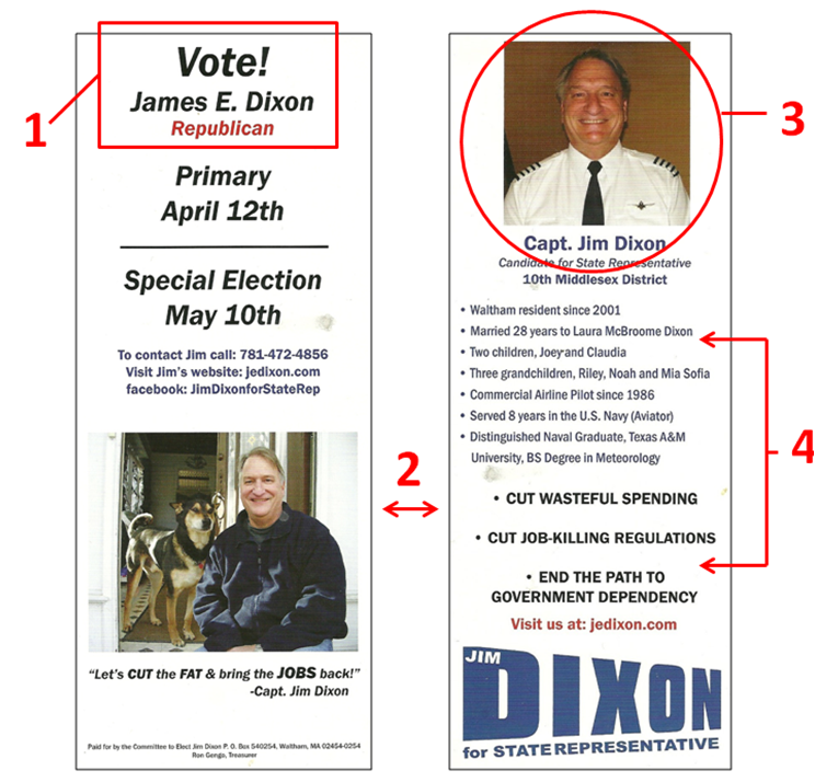
This problem is further accentuated by the call to action at the top of the flyer (1). This is something that should grab people's attention, but instead it is printed using the same font, size, and italics used for the election dates directly underneath. This blends everything together and makes the flyer look as if it is missing a header. There is a certain flow to an advertising brochure that people expect, and it can get confusing when the reader does not even know where to begin.
There is an interesting back story that goes along with the candidate portrait (3). I met Jim at a convention right at the start of his race. After a lengthy conversation about how to kick-off his campaign, I made it a point to emphasize that the first thing he has to do is to get professional photos done. Months later I ran into Jim again and he handed me this card. I looked at it, then looked at him, and all he could tell me is that people really liked the picture of his dog. I shook my head in disgust.
Bullet points are a great tool to organize the information presented on a political push card. Listed on the back of this flyer, there is a group of bullet points immediately followed by another group of bullet points (4). Even though the second group is bold and centered, there is very little distinction between the two separate sections.
White space is always something that is respected in flyer design and this card has plenty of it. Regardless, there is no order to the information within the whitespace resulting in a visually unappealing and confusing experience. This is one of the few cases where poor layout decisions eliminates the advantage of sufficient white space.
The Good
1. Ample white space
2. Nice picture of him with his dog
3. N/A
The Bad
1. Not a clear distinction between the front and the back of the flyer
2. Terrible candidate portrait
3. Poor layout
Overall Rating: F
In contrast to my last pFume review, this flyer is extremely difficult to discern which side is the front and which side is the back (2). I assume that the image pictured on the left is the front since it has basic messaging along with election dates, however, the image on the right includes a candidate portrait and logo sandwiching the majority of the flyer's text.
This problem is further accentuated by the call to action at the top of the flyer (1). This is something that should grab people's attention, but instead it is printed using the same font, size, and italics used for the election dates directly underneath. This blends everything together and makes the flyer look as if it is missing a header. There is a certain flow to an advertising brochure that people expect, and it can get confusing when the reader does not even know where to begin.
There is an interesting back story that goes along with the candidate portrait (3). I met Jim at a convention right at the start of his race. After a lengthy conversation about how to kick-off his campaign, I made it a point to emphasize that the first thing he has to do is to get professional photos done. Months later I ran into Jim again and he handed me this card. I looked at it, then looked at him, and all he could tell me is that people really liked the picture of his dog. I shook my head in disgust.
Bullet points are a great tool to organize the information presented on a political push card. Listed on the back of this flyer, there is a group of bullet points immediately followed by another group of bullet points (4). Even though the second group is bold and centered, there is very little distinction between the two separate sections.
White space is always something that is respected in flyer design and this card has plenty of it. Regardless, there is no order to the information within the whitespace resulting in a visually unappealing and confusing experience. This is one of the few cases where poor layout decisions eliminates the advantage of sufficient white space.
The Good
1. Ample white space
2. Nice picture of him with his dog
3. N/A
The Bad
1. Not a clear distinction between the front and the back of the flyer
2. Terrible candidate portrait
3. Poor layout
Overall Rating: F

Interesting Side Note: I recently visited Jim Dixon's Facebook page and noticed that he finally took my advice and got professional portraits done. When compared to his original photos, it is quite easy to see how important it is to rely on professional photographers to do what they do best.
 RSS Feed