At first glance this push card seems pretty standard, however "standard" is not something that will grab people's attention. There are also some glaring layout mistakes that makes this key campaign tool ineffective.
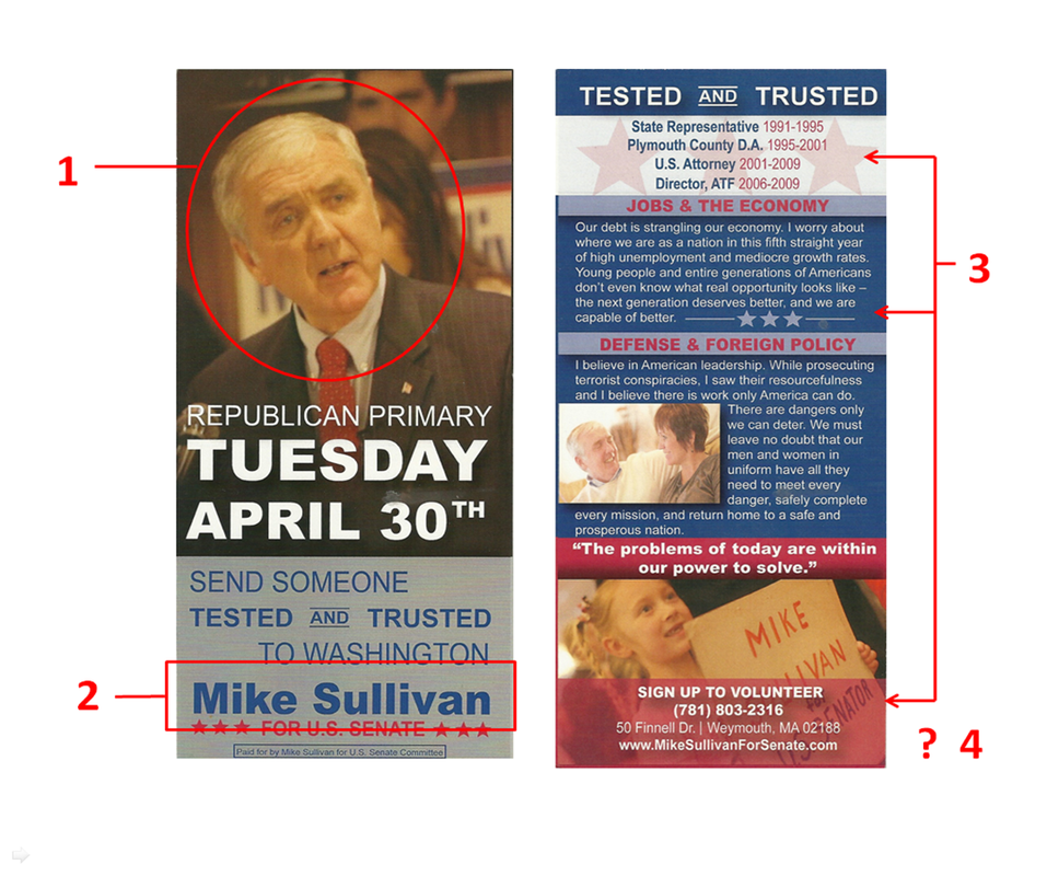
The most noticeable element of this card, the picture, is a complete failure. The picture Sullivan's campaign chose (1) depicts an expression that I am entirely unclear of. Most portraits choose to exhibit an emotional trait like concern or happiness, but this picture looks like one of those strange expressions you have when someone sneaks a picture in mid conversation. Almost more tragically, Sullivan is the oldest candidate in this race and this picture shows me a tired old man instead of someone that is going to tackle the job head on.
A big issue I have with politicians is that most of them think the average voter knows who they are. Sullivan has had held many extraordinary positions including the US Attorney for the Commonwealth of Massachusetts and the Director of the ATF, but if you ask "Average Joe" voter if they heard of Sullivan a majority of the people who tell you they have will only do so out of embarrassment because you put them on the spot.
This card does little to promote the Sullivan brand, a key function of push literature. First, Sullivan's name on the front of the card (2) could not be more hidden. Compressed between the other words on the flyer with little room to breathe, it blends Sullivan's name in with all the other text. If that wasn't bad enough, the blue on grey color scheme is another poor choice preventing Sullivan's name from standing out.
Also, if you took a quick glance at the back of the flyer (4), you would have no idea who's card this is. Always put the name/logo on both sides of the flyer so it is easy to read at a quick look - since this is all you should expect from a prospective voter.
This card breaks another of my pet peeves - trying to fill ever space so it looks like a garbled intimidating mess. There are clear opportunities on the back of this flyer to embrace white space, but instead there are stars and other junk thrown in for no good reason (3). Less is always more and the more space you give the reader, the more apt they are to actually read your message.
The Good
1. Election date very clear (especially for a special election primary)
2. Pictures of little kids are always a good idea
3. N/A
The Bad
1. Tired main photo
2. Candidate's name does not jump out
3. No white space
Overall Rating: D
 RSS Feed