Looking at this flyer from Massachusetts State Representative Alan Silvia only three words come to mind: Too Much Information.
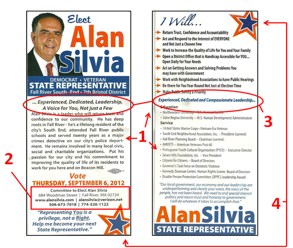
On this push card Silvia gives us the long answer of who he is, what he plans to do, and includes his entire professional resume (1). To accomplish this feat he used a small font size that is usually reserved for the fine print of legal documents. If that was not bad enough, he filled the remaining free space with two unique personalized quotes!
One of the most important aspects of any public servant is accessibility to the public. In order to do this, people have to know how to get in touch with the person representing them. Instead of making this information easy to read, Silvia chose to make it so small that it almost unreadable (2). Even the website url, arguably the most important contact information of a political campaign, is so difficult to read that you practically need a magnifying glass to find it.
Slogans are used by political campaigns to ingrain one specific thought about the candidate in the voter's mind. The slogan has to be consistent and used throughout the campaign for this to work.
In what I believe is Silvia's slogan (this card makes it difficult to know for sure) there is no consistency. On the front of the card it reads, "...Experienced, Dedicated, Leadership, A Voice for You, Not just a Few", while the back of the card reads, "Experienced, Dedicated, and Compassionate Leadership..." (3). There is nothing worse in marketing than getting your own slogan wrong. Silvia should have kept the slogan, "A Voice for You, Not just a Few", enlarged it, and punctuated this on both the front and back of the flyer.
While we are on the subject of these two different slogans, I need to mention the incorrect usage of ellipses, or better known as "...". In one slogan Silvia starts with an ellipsis, while the second slogan ends with an ellipsis. I get confused looking at both of these because I cannot find a single good reason why these ellipses are even being used at all.
As crowded as this card is, there are still opportunities to make this flyer appealing to the eye by creating white space. However, Silvia eliminated these opportunities by ramming graphics of stars in them (4). When designing a flyer remember that creating space will always make it easier for the reader to consume the message.
In his next election, Silvia should find a new graphic designer since this flyer proves the one he used for this one knows nothing about design.
The Good
1. Nice headshot
2. Name clear on both the front and back of the flyer
3. Election date listed
The Bad
1. Too much information
2. Inconsistent campaign slogan
3. Incorrect usage of ellipses
Overall Rating: F
 RSS Feed