 Creating a decent political flyer is not a difficult task to undertake. There are millions of examples out there and print shops usually have stock templates that candidates can customize. This flyer for Jim Dixon who ran in a special election for Massachusetts State Representative, decided to start from scratch while using a graphic designer who probably just started their freshman year of high school.
In contrast to my last pFume review, this flyer is extremely difficult to discern which side is the front and which side is the back (2). I assume that the image pictured on the left is the front since it has basic messaging along with election dates, however, the image on the right includes a candidate portrait and logo sandwiching the majority of the flyer's text.
This problem is further accentuated by the call to action at the top of the flyer (1). This is something that should grab people's attention, but instead it is printed using the same font, size, and italics used for the election dates directly underneath. This blends everything together and makes the flyer look as if it is missing a header. There is a certain flow to an advertising brochure that people expect, and it can get confusing when the reader does not even know where to begin.
There is an interesting back story that goes along with the candidate portrait (3). I met Jim at a convention right at the start of his race. After a lengthy conversation about how to kick-off his campaign, I made it a point to emphasize that the first thing he has to do is to get professional photos done. Months later I ran into Jim again and he handed me this card. I looked at it, then looked at him, and all he could tell me is that people really liked the picture of his dog. I shook my head in disgust.
Bullet points are a great tool to organize the information presented on a political push card. Listed on the back of this flyer, there is a group of bullet points immediately followed by another group of bullet points (4). Even though the second group is bold and centered, there is very little distinction between the two separate sections.
White space is always something that is respected in flyer design and this card has plenty of it. Regardless, there is no order to the information within the whitespace resulting in a visually unappealing and confusing experience. This is one of the few cases where poor layout decisions eliminates the advantage of sufficient white space.
The Good
1. Ample white space
2. Nice picture of him with his dog
3. N/A
The Bad
1. Not a clear distinction between the front and the back of the flyer
2. Terrible candidate portrait
3. Poor layout
Overall Rating: F
 Interesting Side Note: I recently visited Jim Dixon's Facebook page and noticed that he finally took my advice and got professional portraits done. When compared to his original photos, it is quite easy to see how important it is to rely on professional photographers to do what they do best.
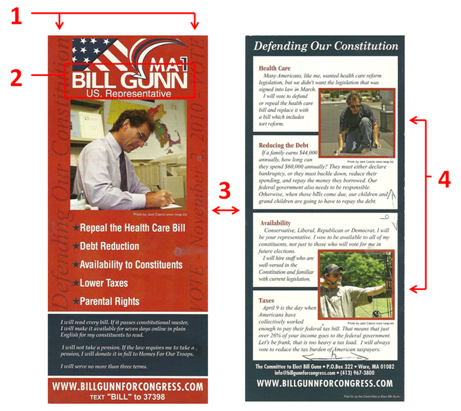
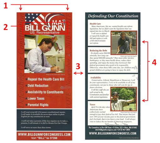 Candidate photos and logos are the two most important marketing tools used by every political campaign. Once these two things are established, all other marketing pieces will fall into place. This flyer by Bill Gunn for US Representative of Massachusetts shows that even the most essential components of a campaign can sometimes be the least effective.
The front of this card has a conventional layout with a few twists. It contains the standard logo, picture, contact information, and also a few bullet points taken from the candidate's platform. An interesting decision was to include the motto and election date using a vertical script with a maroon on red background (1). Even though this was intended to be subtle, anytime you shift the text direction 90° it creates a difficult experience for the reader. Since Gunn also included a rather long personal message on the front, the only area that is not covered in text is the picture.
With the last name "Gunn," there should have been no problems creating a logo that resonates with the voter. However, the logo that was created (2) minimizes the impact by including the stars and stripes, a large checkmark, and a "MA-1." In fact, the checkmark cuts into Gunn's last name which makes it difficult to read - something all campaigns should avoid.
When creating a flyer layout, it is important to make a distinction between the front and back of the flyer. At a quick glance, the reader should know which side of the flyer they are looking at. One thing I like about this flyer is how it accentuates this concept by using red with blue accents on the front, while the back uses blue with red accents (3), making a seamless transition for the reader.
There is an old saying, "A picture is worth 1000 words," and in political marketing this could not be more true. Each of the photos used on this flyer are fine on their own, however, they do not add any diversity when grouped together.
The back of the flyer (4) includes a photograph of Bill doing some roof repair accentuating his blue collar background, while the second photo is intended to appeal to sportsmen. When scanning all of the photos side by side it is rather peculiar that there is no one else photographed other than Bill. The absence of Bill's family, friends, or even supporters makes him seem... well, antisocial. Even worse, not one of these photos of Bill shows him with a smile on his face.
"Of all the things you wear, your expression is the most important." - Janet Lane
The Good
1. Good distinction between the front and back
2. Easy to read bullet points
3. N/A
The Bad
1. Hard to read candidate's name in the logo
2. Vertical and Horizontal words on the front
3. Photographs used are 1 dimensional
Overall Rating: D
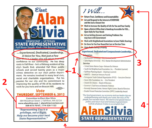 Looking at this flyer from Massachusetts State Representative Alan Silvia only three words come to mind: Too Much Information.
On this push card Silvia gives us the long answer of who he is, what he plans to do, and includes his entire professional resume (1). To accomplish this feat he used a small font size that is usually reserved for the fine print of legal documents. If that was not bad enough, he filled the remaining free space with two unique personalized quotes!
One of the most important aspects of any public servant is accessibility to the public. In order to do this, people have to know how to get in touch with the person representing them. Instead of making this information easy to read, Silvia chose to make it so small that it almost unreadable (2). Even the website url, arguably the most important contact information of a political campaign, is so difficult to read that you practically need a magnifying glass to find it.
Slogans are used by political campaigns to ingrain one specific thought about the candidate in the voter's mind. The slogan has to be consistent and used throughout the campaign for this to work.
In what I believe is Silvia's slogan (this card makes it difficult to know for sure) there is no consistency. On the front of the card it reads, "...Experienced, Dedicated, Leadership, A Voice for You, Not just a Few", while the back of the card reads, "Experienced, Dedicated, and Compassionate Leadership..." (3). There is nothing worse in marketing than getting your own slogan wrong. Silvia should have kept the slogan, "A Voice for You, Not just a Few", enlarged it, and punctuated this on both the front and back of the flyer.
While we are on the subject of these two different slogans, I need to mention the incorrect usage of ellipses, or better known as "...". In one slogan Silvia starts with an ellipsis, while the second slogan ends with an ellipsis. I get confused looking at both of these because I cannot find a single good reason why these ellipses are even being used at all.
As crowded as this card is, there are still opportunities to make this flyer appealing to the eye by creating white space. However, Silvia eliminated these opportunities by ramming graphics of stars in them (4). When designing a flyer remember that creating space will always make it easier for the reader to consume the message.
In his next election, Silvia should find a new graphic designer since this flyer proves the one he used for this one knows nothing about design.
The Good
1. Nice headshot
2. Name clear on both the front and back of the flyer
3. Election date listed
The Bad
1. Too much information
2. Inconsistent campaign slogan
3. Incorrect usage of ellipses
Overall Rating: F
 Balancing the right amount of substance with a design that is pleasing to the eye is tough to do. Too little substance can make a candidate seem unqualified, while too much information jeopardizes how much the reader will retain. This flyer for Massachusetts State Representative, Kim Ferguson is a good example of how to handle that delicate balance.
The front of this card has a very simple design that includes all the basic information you want to resonate with the voter. The font size is large enough to make the information easy to read in a matter of seconds, while the ample border space makes the visual experience inviting to the reader.
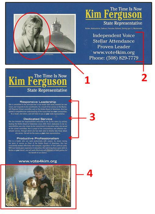
Being a full-color flyer, it is interesting that Ferguson decided to use a black-and-white picture of herself instead of a color one (1). Unconventional as this may be, the lack of color in the picture forces the reader's eye to gravitate to the only splash of color on the front of the flyer - her name. So this may have been done intentionally for this very purpose.
Another critique of this flyer is that the 3 campaign points blends into the contact information (2), making it look like one block of text with 5 lines. Creating more space between the two sections and/or inserting a divider line would give both sections just enough separate distinction.
Looking at the back of the flyer, you will find a very clean layout that complements the front of the flyer quite nicely. There are three distinct sections: Logo, body, and photo - it does not get much simpler than that!
The body itself is broken into 3 sections, all with distinct headings (3). This is where the balancing act is navigated perfectly. Most people will read the headings while bypassing the actual body. Having the right amount of text will validate the heading for those people who choose not to read the body, while providing just enough substance for those readers who want to dig a little deeper.
How many times have you heard the cliché of politicians kissing babies? The reason why this is so prominent is because early on politicians figured out that kids sell, and when you throw puppies on top of it, you have a winning duo that no voter can deny.
In another unconventional move, Ferguson did not include herself in the picture on the back, but instead used a great photo of her son holding his puppy on the waterfront (4). No matter how you look at it, the best political pictures always include puppies, kids, or both - so always make sure to include pictures like these when determining a flyer's layout.
The Good
1. Simple layout
2. Meaningful paragraph titles
3. Kids & Puppies!
The Bad
1. B&W Candidate Photo
2. Bullet points and contact information blends together
3. N/A
Overall Rating: A
 Most 4x9 flyers use a vertical view on both sides, but this flyer by Jim Stanton from Massachusetts utilizes a horizontal layout. Many graphic designers advise to stay away from this approach because it can create an awkward experience for the reader, but I believe that the horizontal view can be effective if done correctly.
At a quick glance three things stand out: the logo (name), website, and a photo. These three things are exactly what needs to be absorbed by the voter. Keeping the front simple is always the best policy.
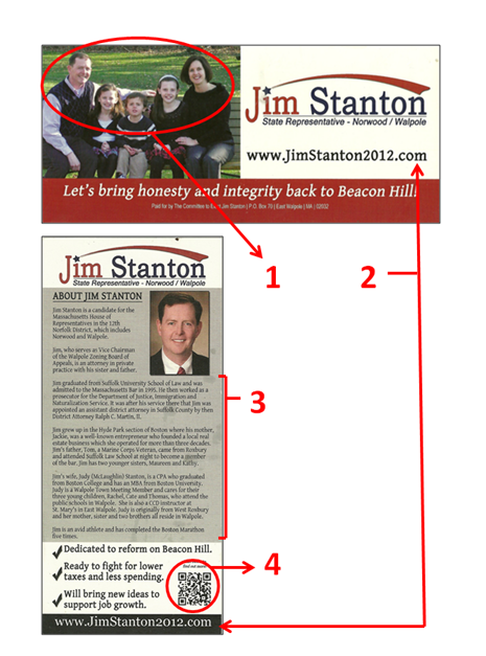
The Stanton family photo (1) is a great picture and I have always advised candidates to include pictures of children even if they do not have any. However, group photos like this can make it tough for the reader to identify with the candidate. Facial recognition is vital to a campaign, so reducing the candidate's head size to a few centimeters makes it difficult to distinguish the candidate at a glance. Moving this picture to the back of the flyer and replacing it with a candidate portrait might be a better way to go.
I have always regarded push cards as portals to get more information, and to effectively do this you have to emphasize where to go. Jim listed his logo and website (2) on both the front and back of the flyer making it easy for an interested reader to grab more information on him.
One glaring concern on the back of this flyer is the amount of text (3). This section talks about his mother's line of work, his father's legacy in law, his wife's involvement in his church, where his kids go to school, the residence of his siblings, as well as other trivial tidbits. Understandably this was done to tie the candidate to his district, but when real estate is so important, this information should have been listed on the website instead. By doing this, it would leave space for easy-to-read messaging that does not intimidate the voter.
I love QR codes (4). I love them so much that it is worth repeating - I love QR codes. These versatile portals to the web can send the person scanning it to any website, so it is refreshing to see Stanton on the forefront of this technology. Look out for QR codes being used more frequently in political marketing.
However, almost everyone that uses QR codes underutilize their potential. I am not ashamed to admit that I have made the same mistake Stanton made on his QR code - directing people to the campaign website.
As our society becomes more social, we connect with things that are tailored directly to us. Driving people to a campaign website is like searching for a lost treasure chest and finding a lonely note saying "great job!" inside. Instead, QR codes should give people a more rewarding experience like a Youtube video of the candidate thanking them for their interest in the campaign. A more personalized experience can bond the voter to the candidate and ultimately earn their vote.
The Good
1. Clean front
2. Repeating Logo and Website
3. QR Code
The Bad
1. Needless information in the body
2. Picture Placement (not picture selection)
3. Landing site of the QR code
Overall Rating: C
 Public Service Announcement - There is no need to adjust the color settings on your computer. The colors that you see are the actual colors of the image. Sorry for the confusion.
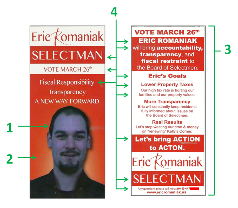
When I first found this flyer I knew I came across the Holy Grail of poorly designed political advertising. I am not sure who gave the final approval of this project, but this flyer is justification for political consultants even at the local level.
One of the most obvious concerns is that the coloring of the portrait makes the candidate look like a Smurf (1). The saturation of blue in the photo gives Romaniak an unnatural appearance and actually blends his skin tone in with his dark clothing and facial hair. I actually visited his Facebook page to see if he had a skin condition, but rest assured, this fatal flyer flaw is completely the fault of the designer.
I cannot think of a single circumstance where I would suggest a solid red background behind a portrait (2). Red is a very aggressive color and can invoke emotions of rage and hostility in the reader. Having the longest wavelength of all colors, it pulls the reader's eyes away from the candidate's portrait which is something designers never want to do. With Romaniak's unnatural blue appearance, he might as well Photoshop horns and a handlebar mustache on his face since this combination gives him an almost demonic appearance.
To save money, candidates sometimes resort to single color printing. When looking at the back of the flyer (3), it is clear how ineffectual this strategy is especially when using an abrasive color like red. The reason why teachers use red pens to grade papers is because it grabs the attention of the student and has them focus on where they went wrong. When everything is red, it is difficult for the reader's eyes to focus on a specific area making it tough to read. It is better to use soft colors for text like black, blue, or grey, while saving red text for punctuation purposes only.
Another disrupting aspect of this flyer is that there is absolutely no consistency of font size (4). On both the front and back of the flyer, each separate section introduces a different font size and/or bold text. Adjusting font size is a great way to make important things stand out, but it is uncomfortable for the reader to go on a roller coaster ride from tiny to gigantic words. Font consistency is always the best policy when designing literature, and this flyer has none.
The Good
1. Front of flyer is not cluttered
2. N/A
3. N/A
The Bad
1. Major color issues
2. Professional photo needed
3. Random font size is distracting
Overall Rating: F
 One thing I always look for in leaflet design is if it stands out from the countless other junk I receive on a daily basis. I look forward to things that break me out of my normal behavioral patterns to stop and take notice of something. Coming home a few weeks ago I had the pleasure of having this political advertisement grab my attention and make me say, "wow, I have to use this idea someday!".
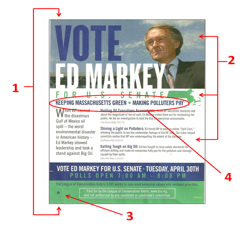
This one-sided flyer for US Senate candidate Ed Markey in Massachusetts was published by an outside organization called the League of Conservation Voters who issued this in support of Markey's stance on environmental issues. Since it is one-sided, there has to be a delicate balance of candidate promotion and substance which this layout did well. The logo and portrait prominently stands out leaving the reader with no mistake about who this flyer is in support of. Also the font size of the body may be a little small, but it effectively uses quotes from various news sources to validate their endorsement.
Another thing I like is that the environmental message of the flyer is not only conveyed in the text, but it is also incorporated in the design (2). I love the clean blue skies behind the image of Markey, while the green silhouette of Massachusetts continues to emphasize their belief that Markey is the "green" candidate. I also like how this point is further punctuated by the subtitle recycle logo (3), which not only expresses that this flyer is printed on recycled paper, but ties the whole environmental focus together.
The only thing I would nit-pick is that at a quick glance this flyer looks like just another political piece pushed out by the Markey campaign instead of a flyer with an environmental slant. The subtle imagery is just that, and this flyer would benefit if it included something more overt to emphasize the focus of the flyer. One solution may be shortening the slogan (4) and increasing the size of a more refined message instead of the two distinct statements that are currently used.
However, it should be noted that sometimes organizations try to disguise the focus of the flyer to make it look as if it came from the campaign itself. This is primarily done when a group wants to support a candidate by getting another marketing piece distributed to the voter, without overtly pushing their specific issue. This strategy may have been the case with this flyer.
So by now you are probably wondering what about this design grabbed my attention and had me talking about it for days. The reason why this flyer is one-sided is that it is a giant post-it note! Along the backside of the flyer there is sticky adhesive (1), which allows supporters to stick this flyer on doors and mailboxes. It is illegal for anyone other than postal workers to put anything in a person's mailbox, but the law does not regulate what people can stick on the mailbox. When I walked up to the house and saw this flyer on the side of the mailbox, it immediately grabbed my attention and broke me out of what I normally expect see as I enter the house - a great sign of effective marketing!
The Good
1. Innovative idea to make the flyer jump out
2. Design of the flyer subtly backs up the message
3. Quotes from the press validates intent of the flyer
The Bad
1. Body of text could be easier to read
2. Environmental message could be more overt (although this might have been done intentionally)
3. N/A
Overall Rating: A
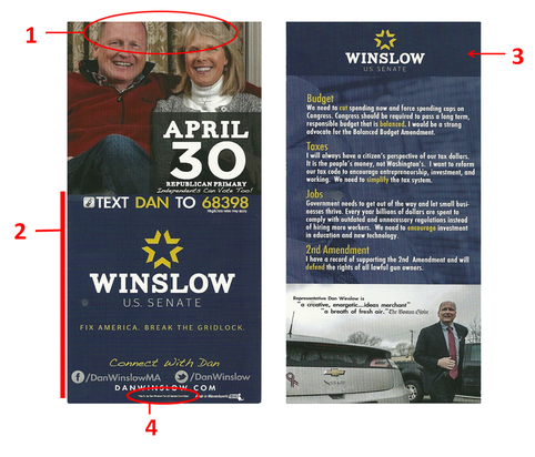 Editing and layout are two of the most important things when finalizing a political push piece. You need to be shrewd enough to know how much information you need to edit out and then have the eye to know where to place what remains. This flyer is a good example of editing out enough content, but needs work on the layout of everything that remains.
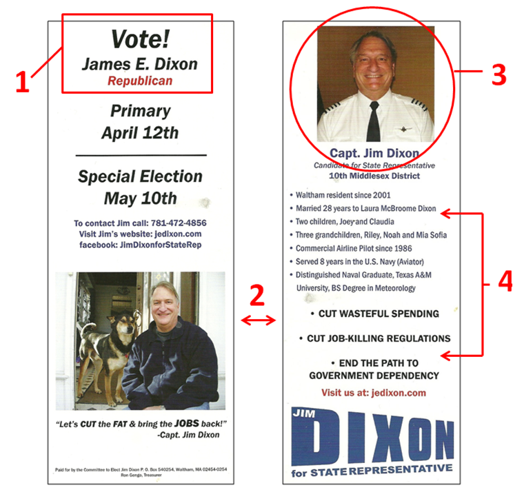
This placement problem is most clearly demonstrated by the candidate portrait on the front of the flyer. The picture of Winslow and his wife is an excellent photo and portrays someone who is family oriented, relaxed (due to attire), with a warm smile. The problem with this photo is that it is chopped off just above the candidate's brow line (1). As soon as you see this, you have to assess what is listed below to determine if it is worth cramming the photo so much.
Underneath the picture (2) you find the date of the election, campaign logo, campaign motto, texting information, Facebook info, Twitter info, and website. The two most important things are well defined, the election date and the logo. In most circumstance the election date does not have be so pronounced, but since this is a special election primary, accentuating this is almost mandatory. You always want to encourage people to connect with your campaign, but to keep the design clean it is sometimes better to list the most important way to connect while listing the rest of the information on the back of the flyer. On this card I would have suggested moving some of the connection information to the back of the flyer which would enable me to clean up everything else.
The back of the flyer is fairly clean and I love the use of effective white space around the logo (3). This really makes Winslow's name stand out which is exactly what you want on both sides of the flyer. The picture of Dan next to his electric car showcases many images that tells you a lot about the candidate (including a red, white, and blue ribbon!). To address the concerns I have with the front of the flyer there are many things you can condense or edit out to include a tidy "connect" section.
One last thing to note. When I work with graphic designers on flyer designs I always ask them to use the smallest font size possible for the "Paid for by the committee..." disclaimer to save room for more important things. It looks like Winslow's designer got the same marching orders since his disclaimer is almost microscopic (4).
The Good
1. White space around logo
2. Pictures with multiple messages
3. Appropriate amount of information
The Bad
1. Photo on front is cramped
2. Information on front could be better spaced
3. N/A
Overall Rating: B
 At first glance this push card seems pretty standard, however "standard" is not something that will grab people's attention. There are also some glaring layout mistakes that makes this key campaign tool ineffective.
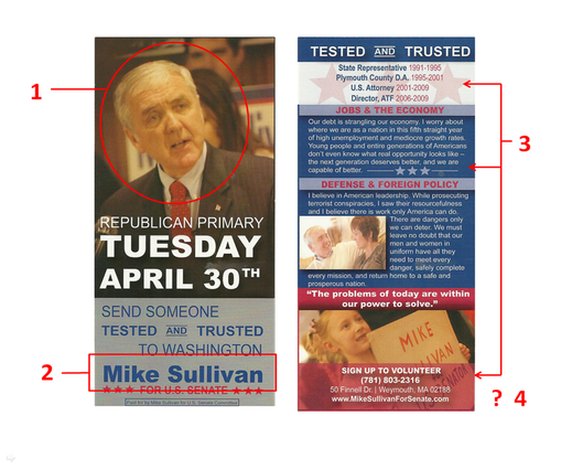
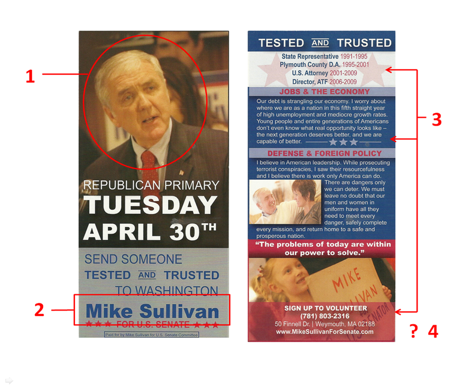
The most noticeable element of this card, the picture, is a complete failure. The picture Sullivan's campaign chose (1) depicts an expression that I am entirely unclear of. Most portraits choose to exhibit an emotional trait like concern or happiness, but this picture looks like one of those strange expressions you have when someone sneaks a picture in mid conversation. Almost more tragically, Sullivan is the oldest candidate in this race and this picture shows me a tired old man instead of someone that is going to tackle the job head on.
A big issue I have with politicians is that most of them think the average voter knows who they are. Sullivan has had held many extraordinary positions including the US Attorney for the Commonwealth of Massachusetts and the Director of the ATF, but if you ask "Average Joe" voter if they heard of Sullivan a majority of the people who tell you they have will only do so out of embarrassment because you put them on the spot.
This card does little to promote the Sullivan brand, a key function of push literature. First, Sullivan's name on the front of the card (2) could not be more hidden. Compressed between the other words on the flyer with little room to breathe, it blends Sullivan's name in with all the other text. If that wasn't bad enough, the blue on grey color scheme is another poor choice preventing Sullivan's name from standing out.
Also, if you took a quick glance at the back of the flyer (4), you would have no idea who's card this is. Always put the name/logo on both sides of the flyer so it is easy to read at a quick look - since this is all you should expect from a prospective voter.
This card breaks another of my pet peeves - trying to fill ever space so it looks like a garbled intimidating mess. There are clear opportunities on the back of this flyer to embrace white space, but instead there are stars and other junk thrown in for no good reason (3). Less is always more and the more space you give the reader, the more apt they are to actually read your message.
The Good
1. Election date very clear (especially for a special election primary)
2. Pictures of little kids are always a good idea
3. N/A
The Bad
1. Tired main photo
2. Candidate's name does not jump out
3. No white space
Overall Rating: D
 There are not many perfect political flyers, but when I saw this one I knew I found the perfect example of what NOT to do. This flyer is so bad that I am keeping it in my portfolio to showcase horrendous campaign decisions. Where to start...
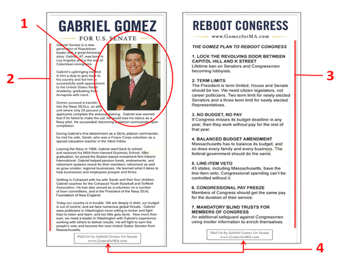
Being the youngest and best looking candidate in this race, the picture of Gabriel Gomez (1) is actually a good one exhibiting a warm, trusting smile. Since this is one of the best selling points of Gomez, this picture could have been better showcased, but it is instead squeezed off to the side making way for an overabundance of text (2).
Most push-cards are used as a portal to drive the reader to places where they can get more information about a candidate like the campaign website or social media. Bypassing this philosophy entirely, Gomez decided to put all the information about him on a single 4x9 card. The front is filled with text that depicts Gomez's history (2) and the backside is filled with more text outlining some of his platform (3). Too much text is tough on the reader's eyes and can intimidate people from reading any of it.
Another thing to note is that Gomez left his name off the back of the flyer. For someone who clearly wants to introduce himself to the public for the first time, you need to hammer that name home with every opportunity you have. It may seem redundant, but you can never push your name enough on the average voter.
And speaking of redundancies, some states require a statement declaring who paid for the political advertisement. This is usually a pain for graphic designers who try to work it into the layout without taking up valuable real estate. Gomez must have really liked this disclaimer since he decided to print it on both sides of the flyer (4). This is an unnecessary effort that takes up space that could be used for more interesting things (hopefully for something other than more text!).
Final Thought - After mulling over this flyer for quite some time, I came up with a justification for a this bizarre flyer design. Gomez was running in a special election with an expected low voter turnout. The standard demographic most likely to vote in this election are people 50 and over. Since these voters are more prone to read newspapers, mailers, etc., it may be possible that this push-card was designed with these voters in mind. However, I still do not believe that this is a strong enough justification to design such a push-card.
The Good
1. Great picture
2. Clean logo
3. N/A
The Bad
1. Way too much text
2. Back looks the same as the front (except the picture)
3. Candidate highlights do not jump out at reader
Overall Rating: F
|


 RSS Feed